
logo concept
presentation \

STRATAGEMSYSTEM.CO
2026 LOGO CONCEPT PRESENTATION
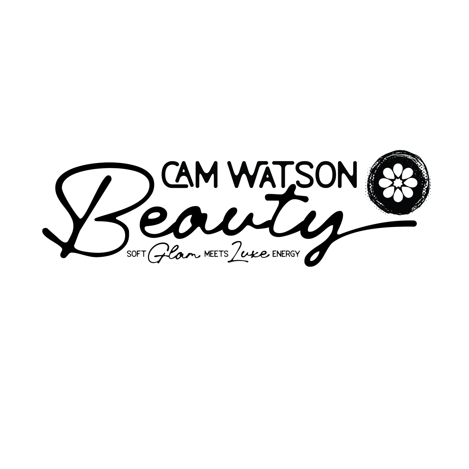
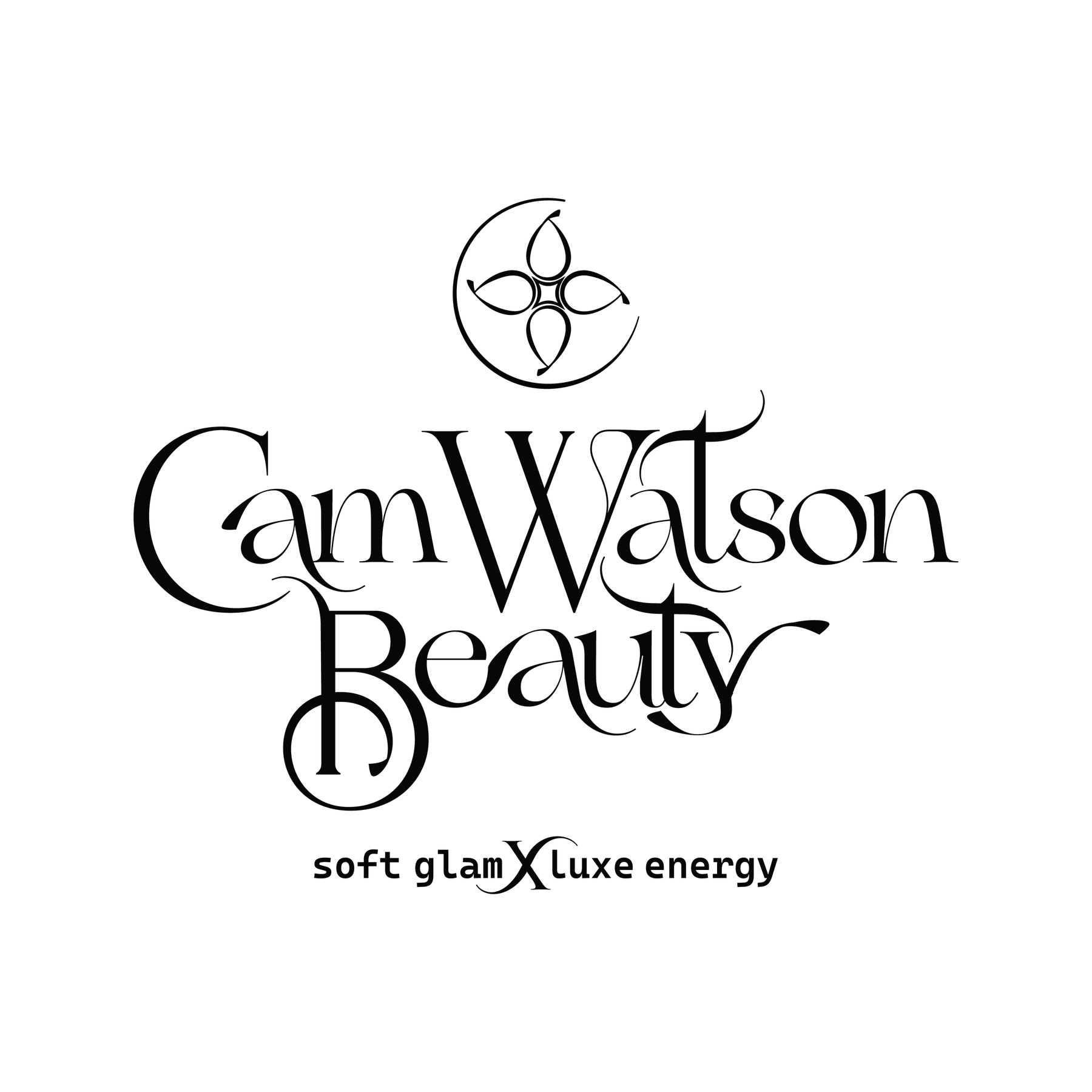
CAM WATSON BEAUTY
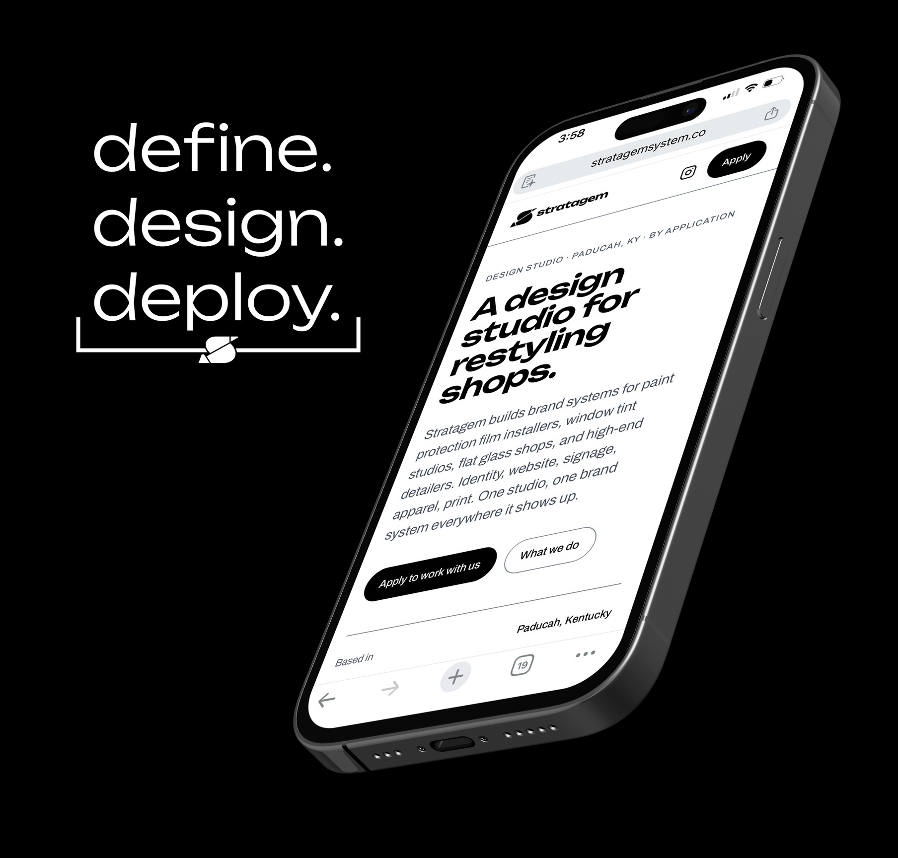
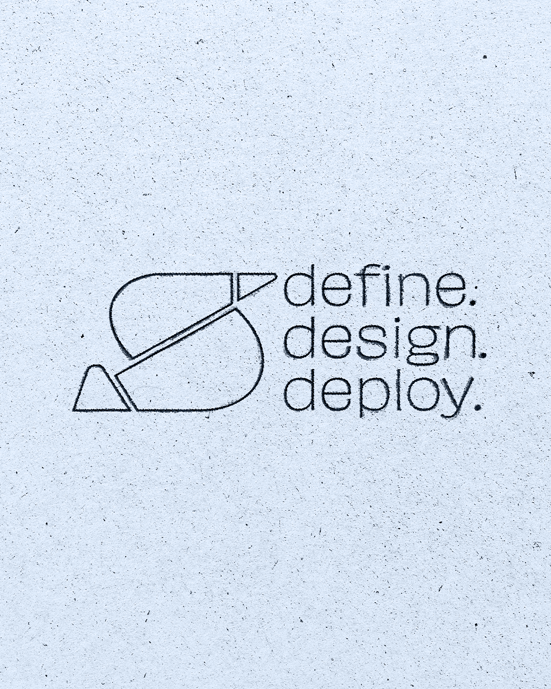
define.design.deploy.
our approach
This is where the foundation starts to take shape.
Inside this presentation, you’ll see icon and logo directions built from the strategy, meaning, and visual language we’ve developed so far. Each concept is designed with intention, not just to look beautiful, but to give the brand something strong enough to grow from.
As you review each direction, pay attention to how it makes you feel. A brand is not only what people see, it is what they remember feeling. The right logo should feel aligned with the personality, experience, and emotion you want your clients to connect with.
From here, we’ll choose the strongest direction and refine it into a complete visual system that can grow across social media, packaging, print, signage, apparel, and digital experiences.
icon
concepts
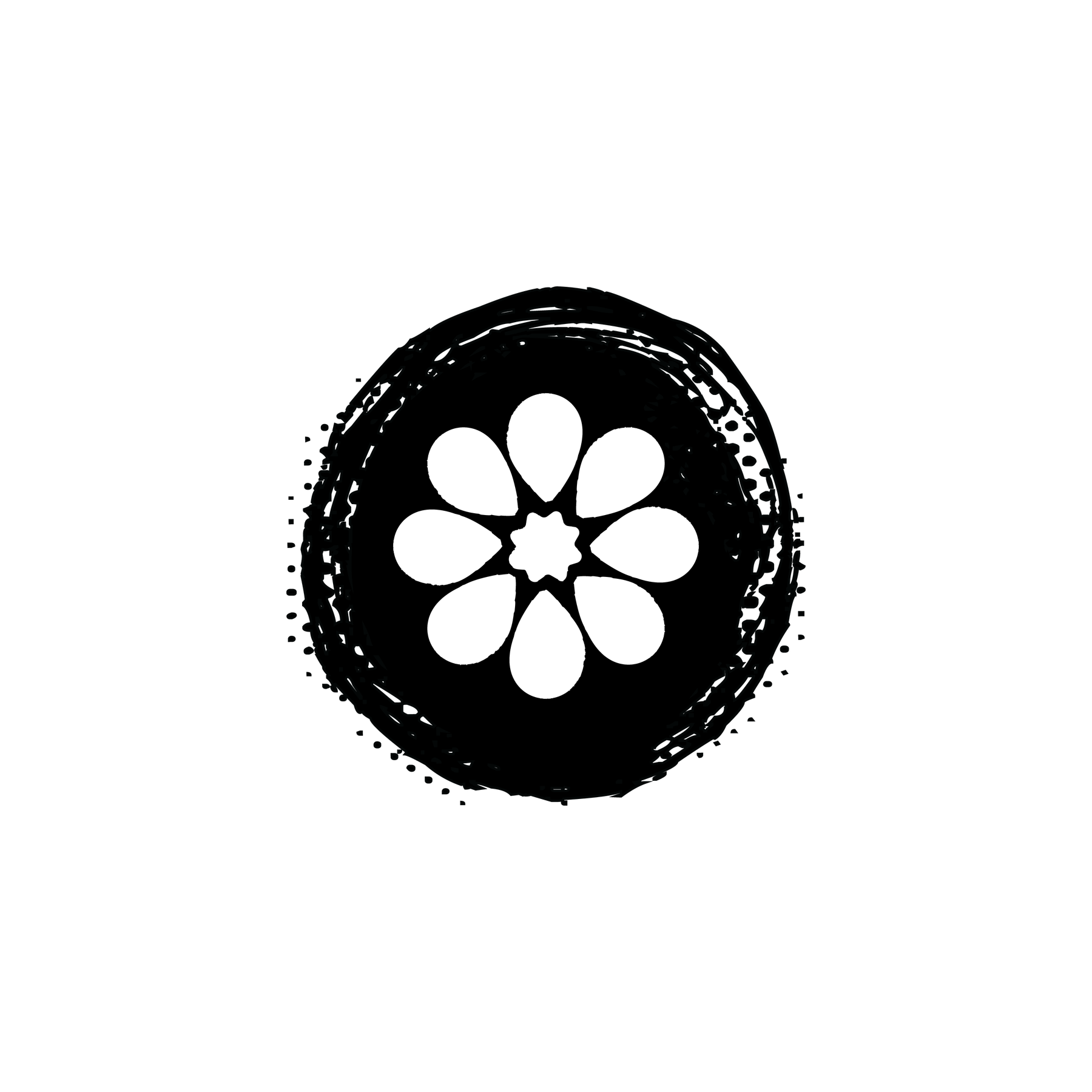
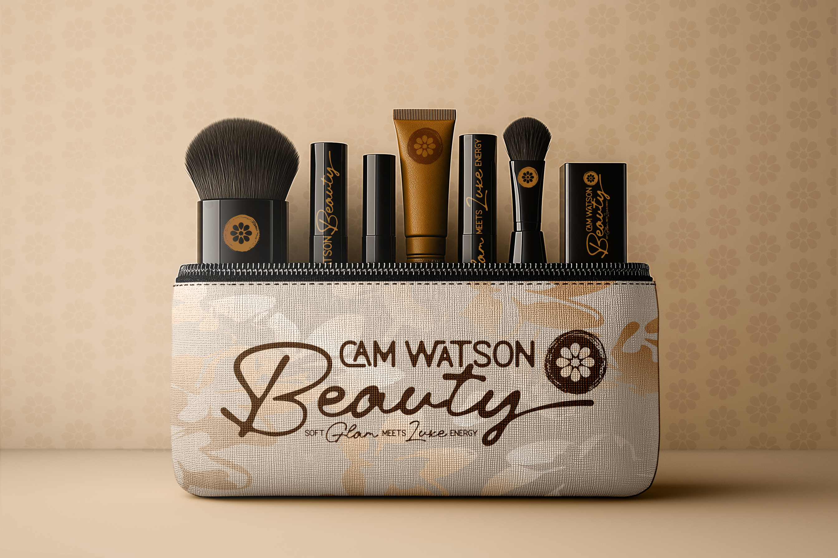
Dab & Bloom
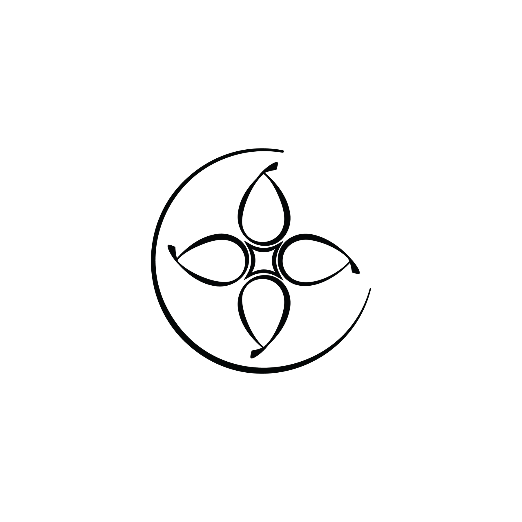
Beauty Clover
We start with the icon because it gives your brand a recognizable foundation.
Your icon is often the first piece of your brand people see, especially on social media, where it may show up as a tiny profile image, watermark, sticker, badge, or product mark.
A strong icon helps people recognize you faster, remember you longer, and connect with your brand even when your full logo or name is not visible.
It also gives us a creative starting point for the rest of your visual system.
The shapes, lines, movement, and personality of the icon can inspire patterns, social graphics, packaging details, merchandise, signage, and other branded elements.
That is why the icon is so important. It is not just a symbol, it is the cornerstone of your brand identity and the piece everything else can grow from.
A makeup-inspired bloom with a glamorous center. symbolizing beauty, confidence, and transformation through artistry.
Refined beauty icon inspired by the soft shape of makeup sponges, blending motions, and floral forms. The four rounded petals create a bloom-like structure while also giving a subtle nod to a four-leaf clover, symbolizing charm, beauty, luck, and confidence.
icon design
rationale
This icon was designed to represent the artistry and transformation behind makeup. The petal shapes are inspired by makeup sponges, forming a flower to symbolize beauty, softness, growth, and blooming confidence.
The outer circle has a dabbed, smudged texture, like product being pressed or blended onto the skin, giving the mark a hands-on beauty feel. At the center, the star adds a touch of glamour, representing the glow, confidence, and radiance that makeup helps bring forward.
Together, the icon feels feminine, artistic, and memorable. It tells a story of beauty in bloom, created through touch, texture, and a little bit of sparkle.
Dab & Bloom
icon design
rationale
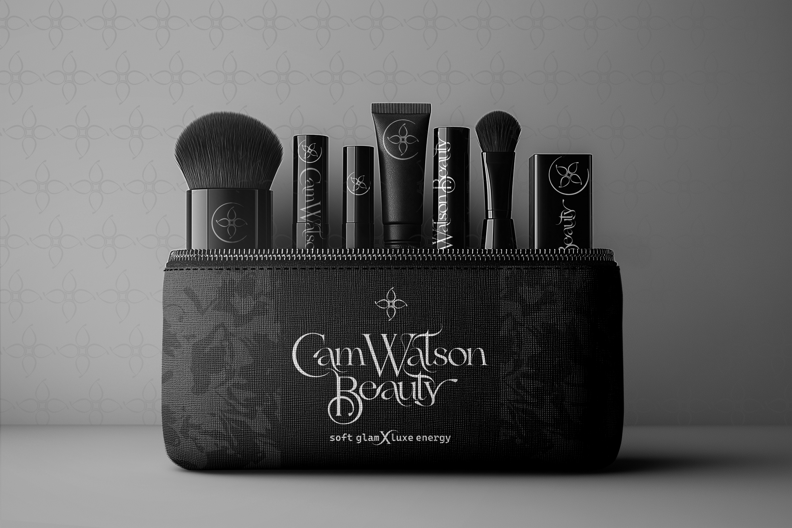
Lucky Bloom is a refined beauty icon inspired by makeup sponges, soft blending motions, floral forms, and the charm of a four-leaf clover.
Its rounded bloom shape brings a sense of luck, positivity, and personal magic, reflecting that moment when a client feels polished, confident, and beautifully put together.
The center star adds glamour, radiance, and transformation, while the outer curved line creates movement and a subtle “C” detail for Cam.
Lucky Bloom feels feminine, polished, memorable, and full of charm. It can stand alone as a social icon, watermark, sticker, or brand accent, while also inspiring patterns, packaging details, social graphics, and supporting brand elements.
Beauty Clover
complete logo design rationale
The icon is built from sponge-inspired petal shapes, forming a soft beauty bloom. Around it, the textured circle feels like makeup being dabbed, pressed, blended, or smudged onto the skin giving the mark a more hands-on, custom feel.
Paired with the handwritten-style “Beauty,” this concept feels warm, approachable, and unique. It gives the impression that every look is created with care, artistry, and personal attention.
This direction is a great fit if you want the brand to feel:
custom, expressive, down-to-earth, artistic, and full of personality.
It has a little attitude around the edges, but still feels soft, feminine, and beauty-focused.
Dab & Bloom
complete logo design rationale
The icon uses four soft sponge-like shapes to create a subtle clover-inspired bloom. This brings in ideas of charm, luck, positivity, and that special “everything came together perfectly” feeling.
The star in the center adds glamour and radiance, while the curved outer line gives a subtle nod to Cam and adds movement around the mark.
Paired with the more elegant typography, this concept feels elevated and graceful. It has a softer luxury feeling. Still approachable, but a little more polished and boutique.
This direction is a great fit if you want the brand to feel:
feminine, refined, graceful, luxe, and beautifully put together.
Beauty Clover
WWW.REALLYGREATSITE.COM
refining the direction.
Once a direction is selected, the identity system begins to take shape.
From logo refinement and typography to color, layout, apparel, signage, and digital application.
Every decision is built to create consistency across the full brand experience.
The goal is simple: create a system that feels intentional wherever the brand appears.
next steps
system development
Select the logo direction that best represents the brand’s personality, positioning, and long-term goals.
From there, the selected concept will move into color palette, then refinement, expansion, and real-world application development.
Once the core identity is approved, the visual system can begin expanding into supporting assets such as apparel, signage, social media, print materials, environments, and branded experiences.
Because consistency builds trust and trust is built through every detail.
keep
connected
with us.
phone
618.334.0844
KAYOCUM@STRATAGEMSYSTEM.CO
address
PADUCAH, KY
website
STRATAGEMSYSTEM.CO